


AutoScout24, based in Munich, is one of the largest European online marketplace for buying and selling new and used cars. With its products and services, the car portal is aimed at private consumers, dealers, manufacturers and advertisers. In this post, we use a high-quality car data set from Germany that was automatically scraped from the AutoScout24 and is available on the Kaggle website. This interesting data set comprises more than 45,000 records of cars for sale in Germany registered between 2011 and 2021.
Outline
- Handling Missing Data
- Overview
- Median Imputation of Missing
hpValues - Mode Imputation of Missing
gearValues - Revisiting Our Data Set
- Exploratory Data Analysis
- Visualizing Categorical Data Using Box Plots
- Scatter Plots: Visualizing the Relationship Between Numerical Data
- Distribution of the Numerical Features
- Checking Correlations Between Price and Numerical Features
- Distribution of Target Variable
Let’s first install and import packages we’ll use and set up the working environment:
!conda install -c conda-forge -q -y squarify
from datetime import datetime
from typing import List, Optional, Union

import matplotlib.pyplot as plt
import matplotlib as mpl
import numpy as np
import pandas as pd
from scipy.stats import probplot

import seaborn as sns
import squarify
# Settings
%config InlineBackend.figure_format = 'retina'
sns.set_theme(font_scale=1.25)
random_seed = 87
Data Loading
Let’s load the data from the dataset file in CSV format. Pandas comes with a handy function read_csv to create a DataFrame from a file path or buffer.
cars_rawdf = pd.read_csv('../data/autoscout24_germany_dataset.csv')
cars_rawdf.info()
<class 'pandas.core.frame.DataFrame'>
RangeIndex: 46390 entries, 0 to 46389
Data columns (total 9 columns):
 #   Column     Non-Null Count  Dtype
---  ------     --------------  -----
 0   mileage    46390 non-null  int64
 1   make       46390 non-null  object
 2   model      46247 non-null  object
 3   fuel       46390 non-null  object
 4   gear       46208 non-null  object
 5   offerType  46390 non-null  object
 6   price      46390 non-null  int64
 7   hp         46361 non-null  float64
 8   year       46390 non-null  int64
dtypes: float64(1), int64(3), object(5)
memory usage: 3.2+ MB
cars_rawdf.sample(frac=1, random_state=random_seed).head(n=10)
| mileage | make | model | fuel | gear | offerType | price | hp | year | |
|---|---|---|---|---|---|---|---|---|---|
| 10316 | 151000 | BMW | 325 | Diesel | Automatic | Used | 13999 | 204.0 | 2011 |
| 25361 | 88413 | Fiat | Punto Evo | Gasoline | Manual | Used | 4740 | 105.0 | 2011 |
| 45829 | 50 | Skoda | Fabia | Gasoline | Manual | Pre-registered | 14177 | 95.0 | 2021 |
| 34066 | 25000 | Citroen | C3 | Gasoline | Manual | Used | 5000 | 73.0 | 2011 |
| 40035 | 48882 | Opel | Mokka | Gasoline | Manual | Used | 13200 | 140.0 | 2016 |
| 39682 | 59500 | SEAT | Mii | Gasoline | Manual | Used | 4450 | 60.0 | 2016 |
| 5457 | 25602 | Ford | Fiesta | Gasoline | Manual | Used | 7840 | 71.0 | 2019 |
| 15175 | 2500 | Volkswagen | Caddy | Diesel | Manual | Demonstration | 38550 | 122.0 | 2020 |
| 18569 | 26828 | Renault | Clio | Gasoline | Manual | Used | 10990 | 90.0 | 2018 |
| 40890 | 167482 | Volkswagen | Golf | Diesel | Manual | Used | 9799 | 110.0 | 2017 |
The data set contains information about cars in Germany (registered between 2011 and 2021), for which we’ll be predicting the sale price. It shows various fields such as make (car brand), hp (horse power), mileage (the aggregate number of miles traveled) etc. A quick look at the offerType field shows that the data set contains five distinct types of offer: Used, Pre-registered, Demonstration, Employer’s car, and New.
print(
    'Counts of unique offer types:',
    cars_rawdf['offerType'].value_counts(),
    sep='\n'
)
Counts of unique offer types:
Used              40110
Pre-registered     2780
Demonstration      2366
Employee's car     1121
New                  13
Name: offerType, dtype: int64
Here, we select data for ‘Used’ cars only to build a model for predicting car sale prices in used-car markets.
After selecting all records for ‘Used’ cars in the original data set, we remove the column offerType since it is same for all entries in the extracted new data set.
cars = cars_rawdf[cars_rawdf['offerType'] == 'Used'].copy()
cars.sample(frac=1).head(n=10)
| mileage | make | model | fuel | gear | offerType | price | hp | year | |
|---|---|---|---|---|---|---|---|---|---|
| 4136 | 47500 | Ford | Fiesta | Gasoline | Manual | Used | 8150 | 71.0 | 2017 |
| 5965 | 98600 | Ford | Transit Custom | Diesel | Manual | Used | 11781 | 101.0 | 2014 |
| 3054 | 61150 | Volkswagen | up! | Gasoline | Manual | Used | 7450 | 60.0 | 2017 |
| 23141 | 22000 | Mazda | CX-3 | Gasoline | Manual | Used | 20000 | 120.0 | 2017 |
| 23861 | 18100 | Nissan | X-Trail | Gasoline | Automatic | Used | 27375 | 159.0 | 2020 |
| 8375 | 31008 | Volkswagen | up! | Gasoline | Manual | Used | 6990 | 60.0 | 2018 |
| 40104 | 64000 | Volkswagen | Golf Variant | Gasoline | Manual | Used | 13800 | 125.0 | 2016 |
| 11711 | 28900 | Renault | Clio | Gasoline | Manual | Used | 8700 | 90.0 | 2017 |
| 10652 | 75367 | Mercedes-Benz | CLA 220 | Diesel | Automatic | Used | 27970 | 177.0 | 2017 |
| 43350 | 14721 | Peugeot | 108 | Gasoline | Manual | Used | 9990 | 72.0 | 2019 |
cars.drop(columns='offerType', inplace=True)
cars.info()
<class 'pandas.core.frame.DataFrame'>
Int64Index: 40110 entries, 0 to 46375
Data columns (total 8 columns):
 #   Column   Non-Null Count  Dtype
---  ------   --------------  -----
 0   mileage  40110 non-null  int64
 1   make     40110 non-null  object
 2   model    39985 non-null  object
 3   fuel     40110 non-null  object
 4   gear     39937 non-null  object
 5   price    40110 non-null  int64
 6   hp       40091 non-null  float64
 7   year     40110 non-null  int64
dtypes: float64(1), int64(3), object(4)
memory usage: 2.8+ MB
Data Manipulation and Cleaning
Numerical Features
Add a New Column: Car Age
The columns year, that is the car registration year, does not solely provide direct information, but rather in combination with current date. A feature that is considered by many car buyers on the used-car markets is the age of the car. In combination with the average anual mileage (that can be different from country to country, and for different years in a given country!), it determines whether a car has reasonable mileage or not. This property is missing in the data set, but we can substract column year from current year and create a meaningful feature named car age:
cars['age'] = datetime.now().year - cars['year']
cars.drop(columns='year', inplace=True)

cars.sample(frac=1).head(n=10)
| mileage | make | model | fuel | gear | price | hp | age | |
|---|---|---|---|---|---|---|---|---|
| 10837 | 180000 | Ford | Focus | Diesel | Manual | 6900 | 95.0 | 6 |
| 31773 | 82500 | Citroen | Berlingo | Diesel | Automatic | 7790 | 92.0 | 9 |
| 35784 | 210000 | Renault | Megane | Diesel | Manual | 3700 | 110.0 | 10 |
| 30646 | 12461 | Audi | Q3 | Diesel | Automatic | 46480 | 190.0 | 2 |
| 25864 | 141500 | Volkswagen | Caddy | Diesel | Manual | 9999 | 102.0 | 7 |
| 31055 | 11316 | Ford | Focus | Gasoline | Manual | 19589 | 125.0 | 2 |
| 13981 | 138994 | Fiat | 500L | Diesel | Manual | 6995 | 105.0 | 8 |
| 17854 | 63290 | Nissan | Pulsar | Diesel | Manual | 9750 | 110.0 | 8 |
| 18375 | 16075 | Ford | Focus | Diesel | Manual | 19996 | 150.0 | 3 |
| 21141 | 162200 | Citroen | C3 | Diesel | Manual | 3890 | 68.0 | 10 |
Mask Outliers
We can identify outliers (that are also considered as missing observations) for numerical features mileage, hp, age, as well as the target variable price. It is obvious that thses values cannot be assigned to zero or negative for any samples in the data set. Therefore, we mask negative values (outliers) for these columns:
numerical_features = ['mileage', 'hp', 'age']

for feature in numerical_features + ['price']:
    cars[feature].mask(cars[feature] < 0, inplace=True)
Categorical Features
Overview
categorical_features = ['make', 'fuel', 'gear']

for feature in categorical_features:
    print(
        f"Categorical feature: '{feature}'\n"
        f"No. of unique elemnts: {cars[feature].nunique()}\n"
        f"Unique values:\n{cars[feature].unique()}"
    )
    print('=' * 40)
Categorical feature: 'make'
No. of unique elemnts: 76
Unique values:
['BMW' 'Volkswagen' 'SEAT' 'Renault' 'Peugeot' 'Toyota' 'Opel' 'Mazda'
 'Ford' 'Mercedes-Benz' 'Chevrolet' 'Audi' 'Fiat' 'Kia' 'Dacia' 'MINI'
 'Hyundai' 'Skoda' 'Citroen' 'Infiniti' 'Suzuki' 'SsangYong' 'smart'
 'Volvo' 'Jaguar' 'Porsche' 'Nissan' 'Honda' 'Lada' 'Mitsubishi' 'Others'
 'Lexus' 'Cupra' 'Maserati' 'Bentley' 'Land' 'Alfa' 'Jeep' 'Subaru'
 'Dodge' 'Microcar' 'Baic' 'Tesla' 'Chrysler' '9ff' 'McLaren' 'Aston'
 'Rolls-Royce' 'Alpine' 'Lancia' 'Abarth' 'DS' 'Daihatsu' 'Ligier'
 'Caravans-Wohnm' 'Aixam' 'Piaggio' 'Morgan' 'Tazzari' 'Trucks-Lkw' 'RAM'
 'Ferrari' 'Iveco' 'DAF' 'Alpina' 'Polestar' 'Maybach' 'Brilliance'
 'FISKER' 'Lamborghini' 'Cadillac' 'Trailer-Anhänger' 'Isuzu' 'Corvette'
 'DFSK' 'Estrima']
========================================
Categorical feature: 'fuel'
No. of unique elemnts: 11
Unique values:
['Diesel' 'Gasoline' 'Electric/Gasoline' '-/- (Fuel)' 'Electric' 'CNG'
 'LPG' 'Electric/Diesel' 'Others' 'Hydrogen' 'Ethanol']
========================================
Categorical feature: 'gear'
No. of unique elemnts: 3
Unique values:
['Manual' 'Automatic' nan 'Semi-automatic']
========================================
Car makes (brands) in our data set possesses a high cardinality, meaning that there too many of unique values of this category. One-Hot Encoding becomes a big problem in this case since we will have a separate column for each unique make value indicating its presence or absence in a given record. This leads to a big problem called the curse of dimensionality: as the number of features increases, the amount of data required to be able to distinguish between these features and generalize learned model grows exponentially. We will come back to this later and use a different encoding algorithm for this feature.
Fuel Type
We group the fuel types of the cars into four major categories: ‘Gasoline’, ‘Diesel’, ‘Electric’ and ‘Others’.
replace_mapping = {'Electric': ['Electric/Gasoline', 'Electric/Diesel'],
                   'Others': ['-/- (Fuel)', 'CNG', 'LPG', 'Hydrogen', 'Ethanol']}

for value, to_replace in replace_mapping.items():
    cars['fuel'].replace(to_replace, value, inplace=True)
Handling Missing Data
Overview
First step here is to get a better picture of the frequency of missing observations in our data set. This is important since it leads us to come to a ‘decision’ about how to treat missing values (i.e. what strategy to use for missing records). Moreover, in order to handle missing observations, also data preparation for training, it is necessary to split the features into numerical and categorical features.
def countplot_missing_data(
    df: pd.DataFrame,
    ax: mpl.axes.Axes,
    **kwargs
) -> None:
    """
    Utility function to plot the counts of missing values in each
    column of the given dataframe `df` using bars.
    """
    missings = df.isna().sum(axis=0).rename('count')
    missings = missings.rename_axis(index='feature').reset_index()
    missings.sort_values('count', ascending=False, inplace=True)

    x = range(missings.shape[0])
    bars = ax.bar(x, missings['count'], **kwargs)

    ax.bar_label(bars, fmt='%d', label_type='edge', padding=3)
    ax.set(xticks=x, xticklabels=missings['feature'])
all_features = {
    'numerical': ['mileage', 'hp', 'age'],
    'categorical': ['make', 'fuel', 'gear']
}

colors = ['teal', 'skyblue']

fig, axes = plt.subplots(1, 2, figsize=(12, 6))
for (item, ax, color) in zip(all_features.items(), axes, colors):
    features_type, features_list = item
    countplot_missing_data(cars[features_list], ax, color=color, width=0.35)
    ax.set(
        title=f'{features_type.capitalize()} Features',
        ylabel='Missing Values, Count [#]'
    )
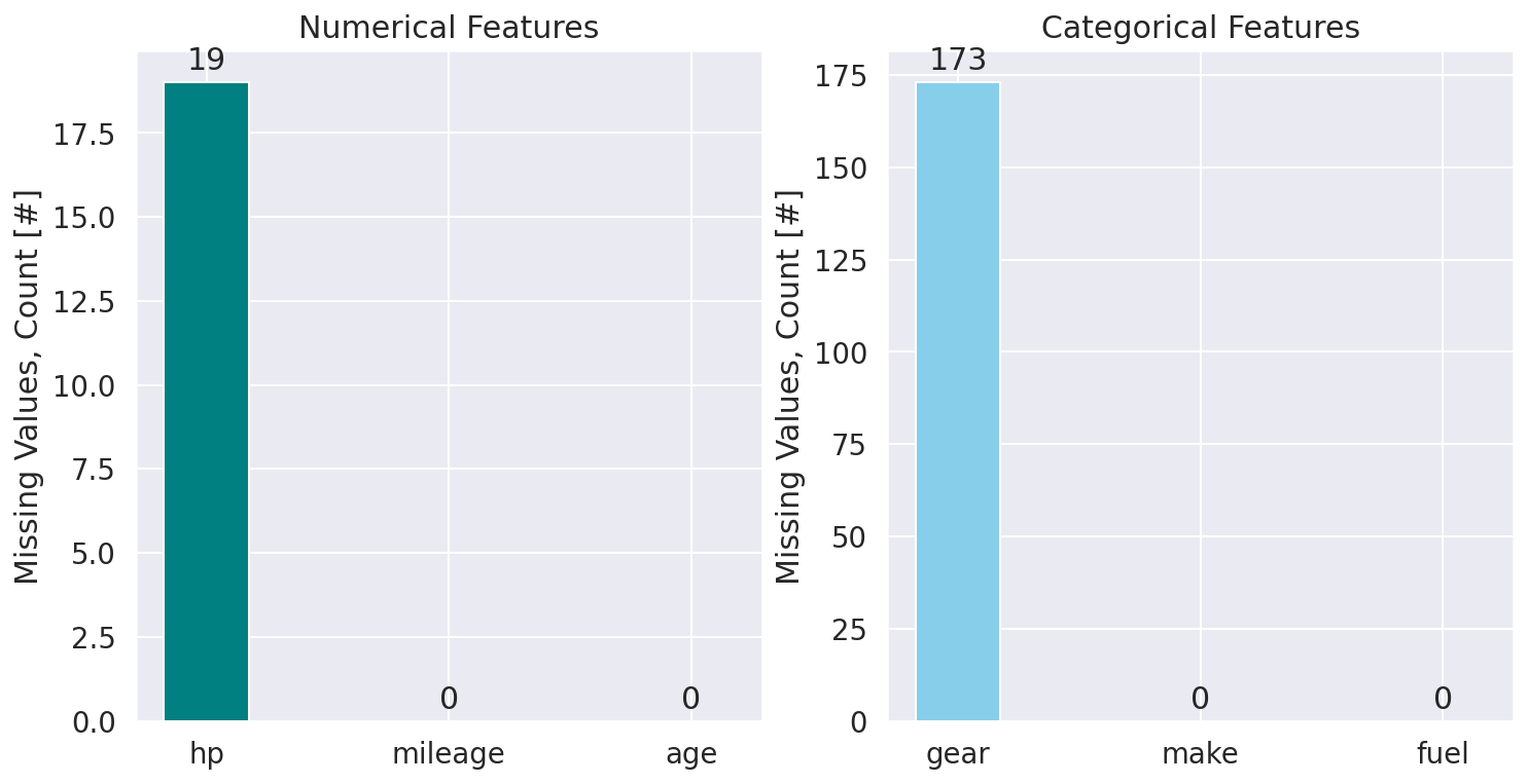
The is really a high-quality data set; no missing values for most of the features available. The number of missing observations for features hp and gear are very small compared to the total number of data (less than 0.05% and 0.5%, respectively). Instead of eliminating (dropping) records for these samples, we try to impute the missing values using information from other records. For the numerical feature hp we use the median and for the categorical feature gear we use most frequrnt imputation strategy to replace missing values. For both cases, we compuate the values of interest for each car make and model, meaning that we first group the data based on make and model:
agg_data = cars.groupby(['make', 'model']).aggregate(
    {'hp': np.nanmedian, 'gear': pd.Series.mode}
)

agg_data.sample(frac=1, random_state=912).head(n=20)
| make | model | hp | gear |
|---|---|---|---|
| Peugeot | 807 | 136.0 | Manual |
| Lexus | GS 450h | 345.0 | Automatic |
| Lada | Niva | 83.0 | Manual |
| Ford | Flex | 314.0 | Automatic |
| Mitsubishi | Eclipse Cross | 163.0 | Automatic |
| Suzuki | Vitara | 120.0 | Manual |
| smart | forTwo | 71.0 | Automatic |
| Citroen | C-Zero | 57.5 | Automatic |
| BMW | X5 M | 400.0 | Automatic |
| Peugeot | Rifter | 131.0 | Manual |
Function below can be used as imputation transformer. This function groups the data based on specific features, then aggregate the grouped data to extract values of interest according to our imputation strategy. Finally, it returns the index and corresponding filling value for each missing observation, so it can be used to update the original data frame and replace the missing values. In the next section, we’ll see how this function comes in handy.
def imputation_transform(
    df: pd.DataFrame,
    label: str,
    group_by: Union[str, List[str]],
    strategy: str
) -> pd.Series:
    """
    Imputation transformer for replacing missing values.

    Parameters
    ----------
    df:
        Main data set.
    label:
        Column for which the missing values are imputed. After groupby,
        the data is aggregated over this column.
    group_by:
        Column, or list of columns used to group data `df`.
    strategy : str, {'mean', 'median', 'most_frequent'}
        The imputation strategy.
        If 'mean' or 'median', then uses equivalent NumPy functions
        ignoring NaNs (`np.nanmean` and `np.nanmedian`, respectively).
        If 'most_frequent', it uses `pd.Series.mode` method.

    Returns
    -------
    Values that can be used to update `df` to replace its missing
    values for the column `label`.
    """
    strategy_maps = {
        'mean': np.nanmean,
        'median': np.nanmedian,
        'most_frequent': pd.Series.mode
    }

    func = strategy_maps[strategy]
    agg_data = df.groupby(group_by).aggregate({label: func})

    def imputer(row):
        """
        Imputation function to apply to each row of the `df` dataframe
        to replace missing values for the feature `agg_over` using the
        imputation strategy `strategy`.
        """
        try:
            x = agg_data.loc[tuple(row[group_by]), label]
            if isinstance(x, np.ndarray):
                fill_value = x[0] if x.size != 0 else np.nan
            else:
                fill_value = x
        except KeyError:
            fill_value = np.nan

        return fill_value

    nan_idx = df[label].isna()
    return df.loc[nan_idx].apply(lambda row: imputer(row), axis=1)
Median Imputation of Missing hp Values
hp_imp = imputation_transform(
    df=cars,
    label='hp',
    strategy='median',
    group_by=['make', 'model']
)

cars['hp'].update(hp_imp)
Mode Imputation of Missing gear Values
gear_imp = imputation_transform(
    df=cars,
    label='gear',
    strategy='most_frequent',
    group_by=['make', 'model']
)

cars['gear'].update(gear_imp)
Revisiting Our Data Set
all_features = {
    'numerical': ['mileage', 'hp', 'age'],
    'categorical': ['make', 'fuel', 'gear']
}

colors = ['teal', 'skyblue']

fig, axes = plt.subplots(1, 2, figsize=(12, 6))
for (item, ax, color) in zip(all_features.items(), axes, colors):
    features_type, features_list = item
    countplot_missing_data(cars[features_list], ax, color=color, width=0.35)
    ax.set(
        title=f'{features_type.capitalize()} Features',
        ylabel='Missing Values, Count [#]'
    )
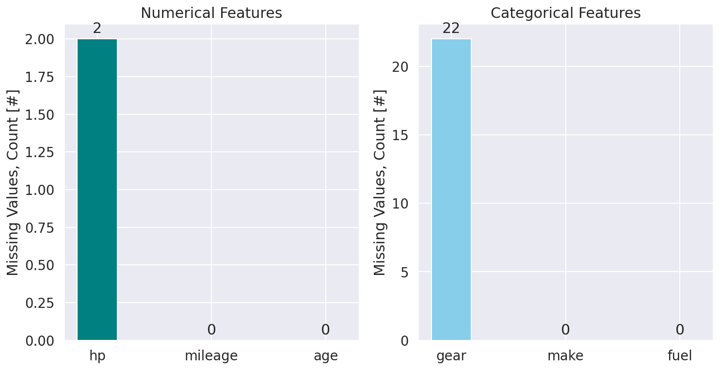
So far so good. We successfully handelled the missing values for most of the records in the data set. But there are still some missing observations. At this point, we could simply eliminate (drop) records for these samples:
cars.dropna(axis=0, subset=['hp', 'gear'], inplace=True)
cars.info()
<class 'pandas.core.frame.DataFrame'>
Int64Index: 40088 entries, 0 to 46375
Data columns (total 8 columns):
 #   Column   Non-Null Count  Dtype
---  ------   --------------  -----
 0   mileage  40088 non-null  int64
 1   make     40088 non-null  object
 2   model    39977 non-null  object
 3   fuel     40088 non-null  object
 4   gear     40088 non-null  object
 5   price    40088 non-null  int64
 6   hp       40088 non-null  float64
 7   age      40088 non-null  int64
dtypes: float64(1), int64(3), object(4)
memory usage: 2.8+ MB
Exploratory Data Analysis
Visualizing Categorical Data Using Treemaps
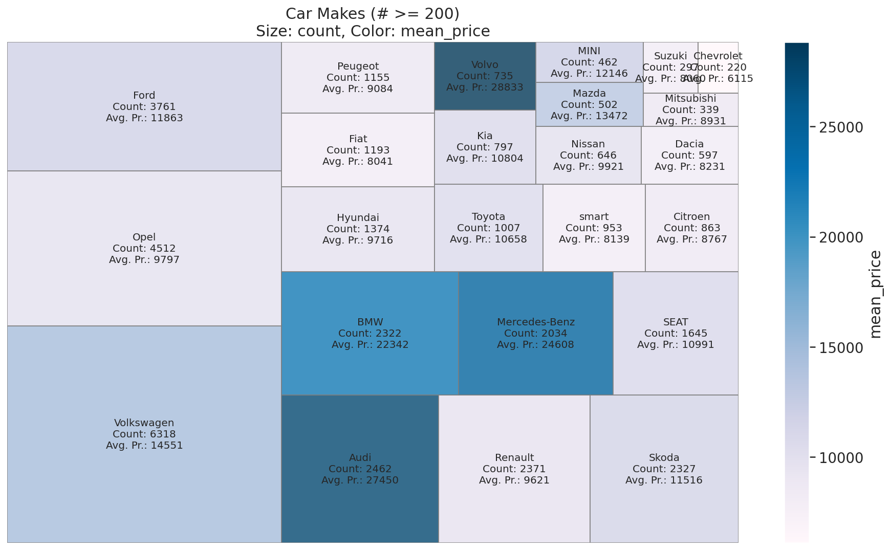
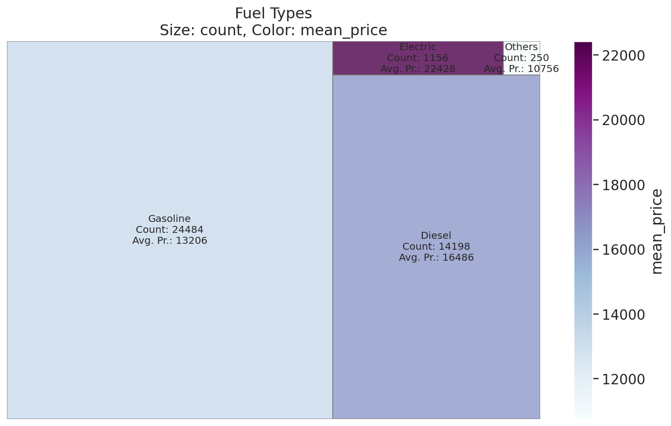
Treemap is a popular visualization technique used to visualize ‘Part of a Whole’ relationship. Treemaps are easy to follow and interpret. Treemaps are often used for sales data, as they capture relative sizes of data categories, allowing for quick perception of the items that are large contributors to each category. Apart from the sizes, categories can be colour-coded to show a separate dimension of data. Here, we use treemap visualization to explore the relative sizes (counts) of different categories and their average price in the data sat. The size of nested grids in our treemap visualization represents the counts of each category, and grid-cell colours indicate the mean price for that category.
def plot_treemap(
    df: pd.DataFrame,
    size_key: str,
    color_key: str,
    ax: mpl.axes.Axes,
    cmap: mpl.colors.Colormap = mpl.cm.Blues,
    font_size: int = 8,
    title_prefix: Optional[str] = None,
    **kwargs
) -> None:
    """
    Utility function to plot treemaps for categorical features using squarify.

    Parameters
    ----------
    size_key:
        Column name whose numeric values specify sizes of rectangles.
    color_key:
        Column name whose numeric values specify colors of rectangles.
    ax:
        Matplotlib Axes instance.
    cmap:
        Matplotlib colormap.
    font_size:
        Set font size of the label text.
    title_prefix:
        Text to prepend to the figure title.
    **kwargs:
        Additional keyword arguments passed to matplotlib.Axes.bar by
        squarify (e.g. `edgecolor`, `linewidth` etc).
    """
    df_sorted = df.sort_values(by=size_key, ascending=False)
    sizes = df_sorted[size_key]

    norm = mpl.colors.Normalize(vmin=df[color_key].min(), vmax=df[color_key].max())

    colors = [cmap(norm(x)) for x in df_sorted[color_key]]

    labels = [
        f"{entry[0]}\nCount: {entry[1]}\nAvg. Pr.: {entry[2]:.0f}"
        for entry in df_sorted.values
    ]

    squarify.plot(sizes=sizes, color=colors, label=labels, ax=ax, **kwargs)

    ax.axis('off')
    for text_obj in ax.texts:
        text_obj.set_fontsize(font_size)

    fig = ax.get_figure()
    cbar = fig.colorbar(mpl.cm.ScalarMappable(norm, cmap), ax=ax)
    cbar.set_label(color_key)

    title = f"Size: {size_key}, Color: {color_key}"
    if title_prefix:
        title = title_prefix + '\n' + title
    ax.set_title(title)
def get_category_meanprice(
    df_in: pd.DataFrame,
    categ_key: str
) -> pd.DataFrame:
    """
    Utility function to get mean price for a given categorical feature.

    Parameters
    ----------
    df_in:
        Input dataframe.
    categ_key:
        Categorical feature name (column name).

    Returns
    -------
    df_out:
        Output dataframe with column names `['count', 'mean_price']`.
    """
    df_out = pd.concat(
        objs=[
            df_in[categ_key].value_counts().rename('count'),
            df_in.groupby(categ_key)['price'].mean().rename('mean_price')
          ],
        axis=1
    )

    df_out.reset_index(drop=False, inplace=True)
    df_out.rename(columns={'index': categ_key}, inplace=True)

    return df_out
Car Makes (Brands)
print(
    f"Number of unique car-makes: {cars['make'].nunique()}",
    f"Unique car makes listed in the data set:",
    sep='\n'
)

cars['make'].unique()
Number of unique car-makes: 72
Unique car makes listed in the data set:

array(['BMW', 'Volkswagen', 'SEAT', 'Renault', 'Peugeot', 'Toyota',
       'Opel', 'Mazda', 'Ford', 'Mercedes-Benz', 'Chevrolet', 'Audi',
       'Fiat', 'Kia', 'Dacia', 'MINI', 'Hyundai', 'Skoda', 'Citroen',
       'Infiniti', 'Suzuki', 'SsangYong', 'smart', 'Volvo', 'Jaguar',
       'Porsche', 'Nissan', 'Honda', 'Lada', 'Mitsubishi', 'Others',
       'Lexus', 'Cupra', 'Maserati', 'Bentley', 'Land', 'Alfa', 'Jeep',
       'Subaru', 'Dodge', 'Microcar', 'Baic', 'Tesla', 'Chrysler', '9ff',
       'McLaren', 'Aston', 'Rolls-Royce', 'Lancia', 'Abarth', 'DS',
       'Daihatsu', 'Ligier', 'Caravans-Wohnm', 'Aixam', 'Piaggio',
       'Alpine', 'Morgan', 'RAM', 'Ferrari', 'Iveco', 'Alpina',
       'Polestar', 'Maybach', 'Brilliance', 'FISKER', 'Lamborghini',
       'Cadillac', 'Isuzu', 'Corvette', 'DFSK', 'Estrima'], dtype=object)
# Count up cars by `make` feature & average `price`s for each `make` type
makes = get_category_meanprice(cars, 'make')

# Select data w/ a minimum number of items
min_nitems = 200
indexer = makes['count'] >= min_nitems

treemap_kwargs = dict(edgecolor='gray', linewidth=1, font_size=10, alpha=0.8)

fig, ax = plt.subplots(figsize=(16, 9))
plot_treemap(
    makes.loc[indexer, :],
    'count',
    'mean_price',
    ax,
    cmap=mpl.cm.PuBu,
    title_prefix=f'Car Makes (# >= {min_nitems})',
    **treemap_kwargs
)
Fuel Types
# Count up cars by `fuel` feature & average `price`s for each `fuel` type
fuels = get_category_meanprice(cars, 'fuel')

fig, ax = plt.subplots(figsize=(12, 7))
plot_treemap(
    fuels,
    'count',
    'mean_price',
    ax,
    cmap=mpl.cm.BuPu,
    title_prefix='Fuel Types',
    **treemap_kwargs
)
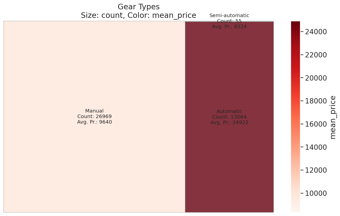
Gear Types
# Count up cars by `gear` feature & average `price`s for each `gear` type
gears = get_category_meanprice(cars, 'gear')

fig, ax = plt.subplots(figsize=(12, 7))
plot_treemap(
    gears,
    'count',
    'mean_price',
    ax,
    cmap=mpl.cm.Reds,
    title_prefix='Gear Types',
    **treemap_kwargs
)
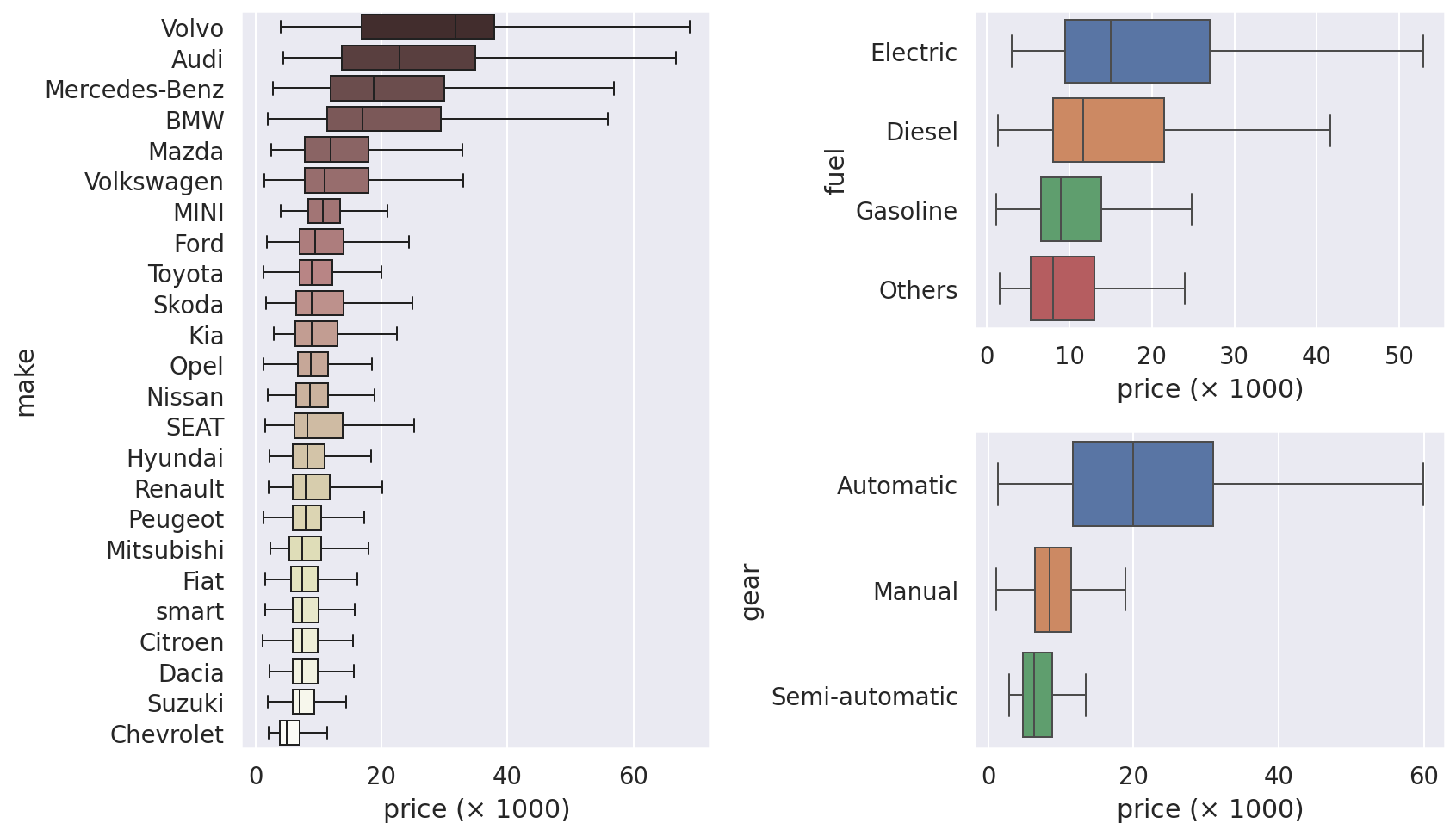
Visualizing Categorical Data Using Box Plots
min_nitems = 200
s = cars['make'].value_counts() > min_nitems
indexer = cars['make'].isin(s[s].index)
order = cars[indexer].groupby('make')['price'].median().sort_values(ascending=False).index

fig = plt.figure(figsize=(12, 7), tight_layout=True)
gs = mpl.gridspec.GridSpec(2, 2)
boxplot_kwargs = dict(orient='h', showfliers=False, linewidth=1)

sns.boxplot(
    y=cars.loc[indexer, 'make'],
    x=cars.loc[indexer, 'price'] / 1e+3,
    ax=fig.add_subplot(gs[:, 0]),
    order=order,
    palette='pink',
    **boxplot_kwargs
)

for ifeature, feature in enumerate(['fuel', 'gear']):
    order = cars.groupby(feature)['price'].median().sort_values(ascending=False).index
    sns.boxplot(
        y=cars[feature],
        x=cars['price'] / 1e+3,
        ax=fig.add_subplot(gs[ifeature, 1]),
        order=order,
        **boxplot_kwargs
    )

for ax in fig.get_axes():
    ax.set_xlabel(r'price ($\times$ 1000)')
Scatter Plots: Visualizing the Relationship Between Numerical Data
fig, axes = plt.subplots(1, 3, figsize=(14, 4.5))
fig.tight_layout(w_pad=2.5)

for (feature, ax) in zip(all_features['numerical'], axes):
    ax.scatter(cars[feature], cars['price'] / 1e+3, edgecolor='w', alpha=0.8)
    ax.set(xlabel=feature, ylabel=r'price ($\times$ 1000)')

axes[0].set(ylabel=r'price ($\times$ 1000)');
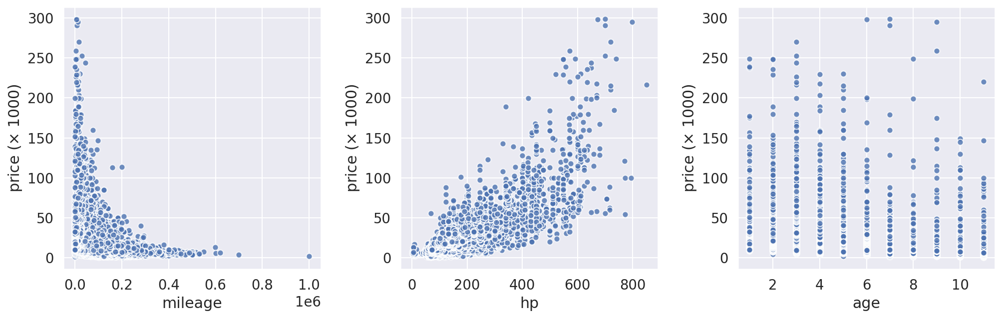
Scatter plots above shows that the car sale prices have high correlation with mileage and hp. Moreover, these plots reveal another important characteristic of the data: heteroscedasticity. We can see that the predictive variable (price) monitored over different independent variables show unequal variability (particularly, over hp feature. Look at the cone-shape of the scatter plot). This means that a linear regression model is not a proper model to predict the sale price for this data set, sice the heteroscedasticity of the data will ruin the results.
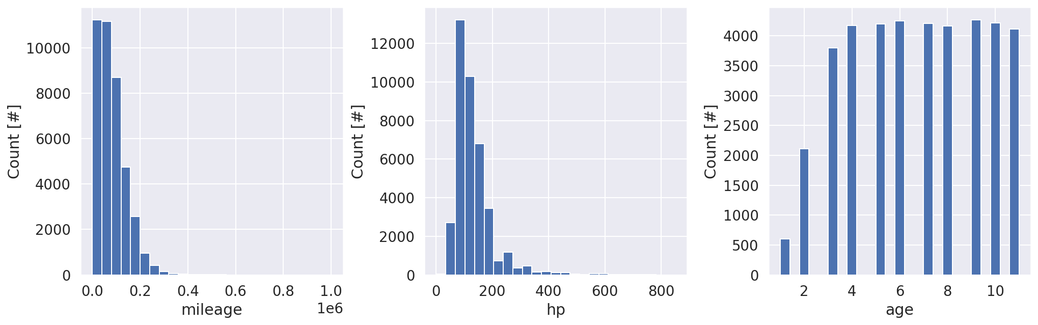
Distribution of the Numerical Features
fig, axes = plt.subplots(1, 3, figsize=(14, 4.5))
fig.tight_layout(w_pad=2.5)

for (feature, ax) in zip(all_features['numerical'], axes):
    ax.hist(cars[feature], bins=25)
    ax.set(xlabel=feature, ylabel='Count [#]')
Checking Correlations Between Price and Numerical Features
corr = cars.corr()
new_order = ['price'] + numerical_features
corr = corr.reindex(index=new_order, columns=new_order)

mask = np.zeros_like(corr, dtype=bool)
mask[np.triu_indices_from(mask)] = True

fig, ax = plt.subplots(figsize=(6, 5))
ax.set_facecolor('none')
sns.heatmap(corr, ax=ax, mask=mask, annot=True, cmap='BrBG', vmin=-1);
<img src=”/assets/img/2021-11-05-car-price-germany-eda/output_55_0.png” class=”center_img” style=”width: 50%;”
The highest correlation shows for price with horsepower hp and age (no big news). Looking at negative correlation between price with age also seems natural.
Distribution of Target Variable
prices = cars['price'] / 1e+3

bin_width = 5   # in €1000
nbins = int(round((prices.max() - prices.min()) / bin_width)) + 1
bins = np.linspace(prices.min(), prices.max(), nbins)

fig, (ax1, ax2) = plt.subplots(1, 2, figsize=(12, 6))
ax1.hist(prices, bins=bins)
ax1.set(xlabel=r'Price ($\times$ 1000)', ylabel='Count [#]')
_ = probplot(prices, plot=ax2)
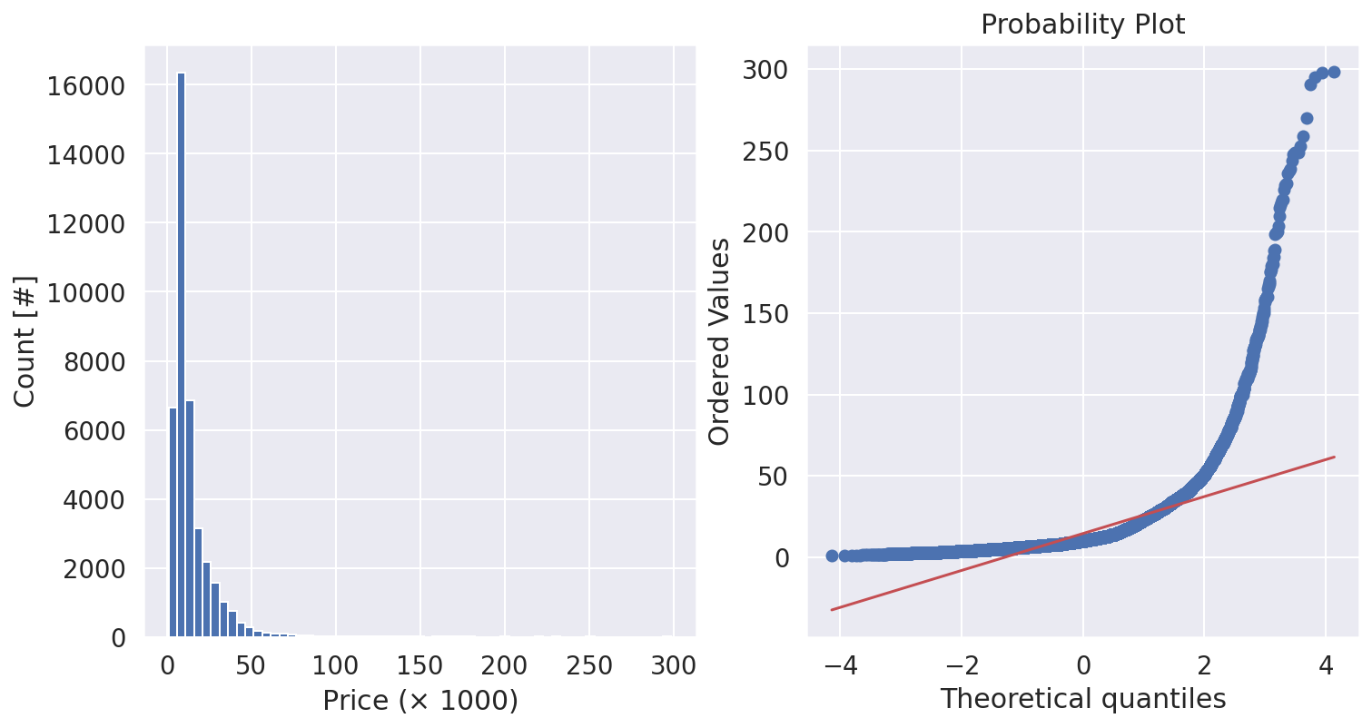
The target distribution (of sale prices) is so skewed. Most of regression algorithms perform best when the target variable is normally distributed (or close to normal) and has a standard deviation of one.
Save Processed Data to a New CSV File
cars.to_csv(
    '../data/autoscout24_germany_dataset_cleaned.csv',
    header=True,
    index=False
)